

Make it look right
A map is looked at before it’s read. If every card is the same size and colour, people have to read every name to find what matters. Make the important parts big, the supporting ones small, and give colour one meaning, and they’ll see the shape of your system before they read a word.
How a part looks never changes what it is or how traffic moves through it. Look and behaviour are separate, so style freely.
Try it
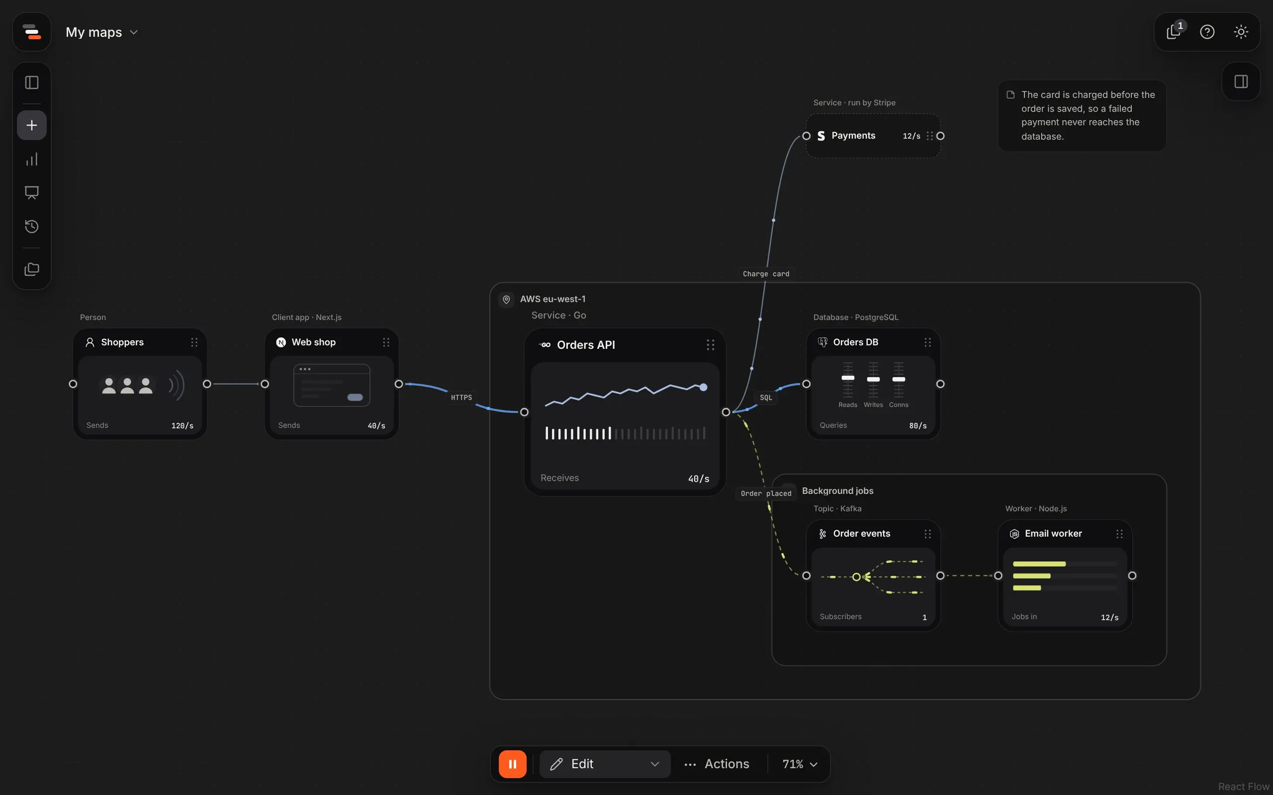
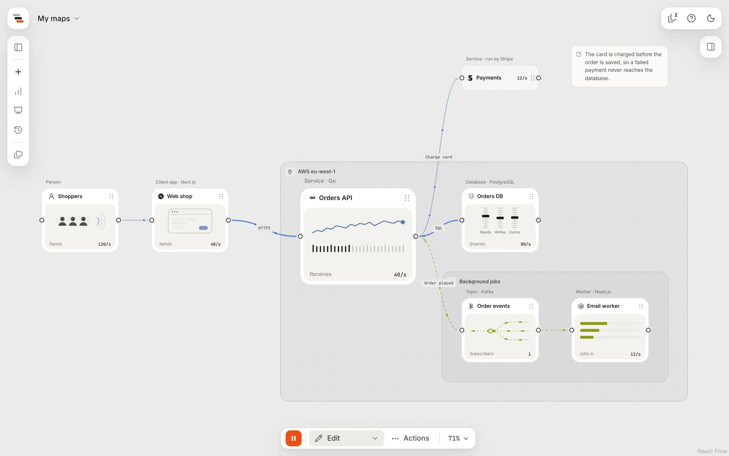
Section titled “Try it”On the Checkout system template, make the order path stand out:
-
Select Orders API, open its Look tab, and pick Large under size. It’s the part the map is about, so it should look it.
-
Select Payments and pick the Slim card. Stripe runs it, so it needs less room.
-
Select the lines from Web shop to Orders API and from Orders API to Orders DB, holding ⌘. In Style, set the colour to blue and the weight to bold.
Start from a preset
Section titled “Start from a preset”The library’s Presets shelf holds 117 parts ready to go, such as Cloudflare DNS, a web firewall, a token bucket limiter, a Redis cache, a Kafka topic, Claude or Stripe payments.
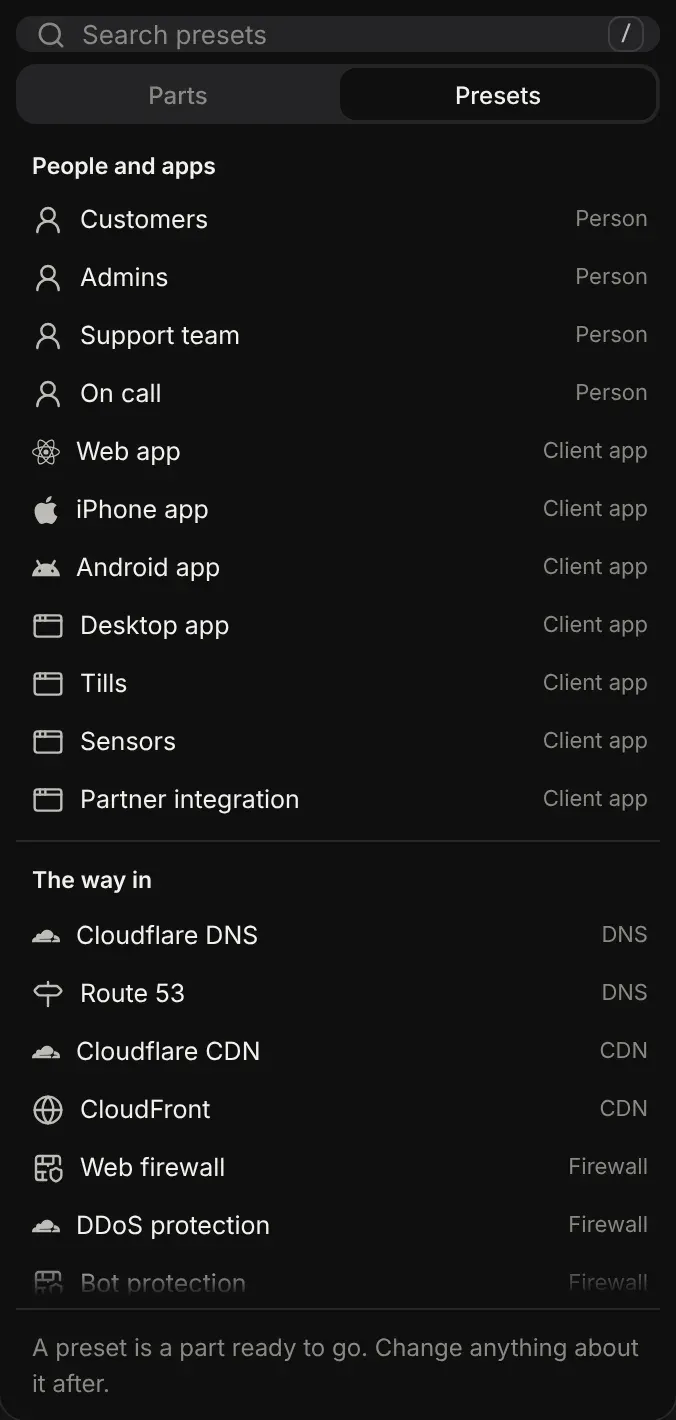
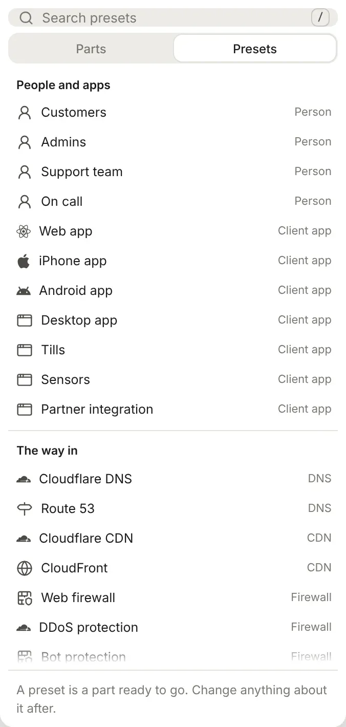
A preset fills in a part’s kind, name, drawing, card, technology and whether someone else runs it, with sensible starting limits: a rate limiter’s limit, a queue’s buffer, a service’s capacity and how it auto-scales. Everything it fills in is only where the part starts. Change any of it afterwards, as with any part.
A search in the library looks through the plain parts and the presets at once. Presets lists them all.
When Flozu knows a part’s technology, its mark is that technology’s logo, in one colour. Otherwise it’s the kind’s icon. Logos come from Simple Icons; the brands belong to their owners. Some brands, such as AWS and OpenAI, don’t allow their logo there, so those parts keep the kind’s icon.
A bigger share of your system can look bigger. Select a part and drag one of its corners. It snaps to the grid, from 160 by 48 up to 640 by 512. Its left and right edges are its ports, so only the corners resize it.
Or pick a size in the Look tab: small, standard, large or extra large, each in the shape of the part’s card. A standard card is 192 by 160, large is 288 by 240 and extra large 384 by 320.
The drawing grows to fill the card and keeps its shape. The name and figure grow a little with it, so a part twice the size reads as bigger without shouting.
Card layouts
Section titled “Card layouts”Each part picks its card in the Look tab. A map can mix them freely.
| Card | What it shows |
|---|---|
| Standard | The name on top, then the drawing and one figure. |
| Showcase | The drawing fills the top of the card, with the name and figure below it. |
| Wide | A wide card: the name and figure on the left, the drawing on the right. |
| Slim | One slim line with the icon, the name and the figure, and no drawing. |
Each layout has a shape of its own, so picking one also gives the part that layout’s size: a standard card is 192 by 160, showcase 192 by 176, wide 320 by 144 and slim 192 by 64. A large part stays large, and its ports stay at the same height so its lines don’t bend.
You don’t have to pick a layout to change how a card reads. Resizing is enough:
- A card shorter than 112 shows as a slim line, since there’s no room for a drawing.
- A standard or showcase card at least twice as wide as it is tall shows as a wide one.
Drawings
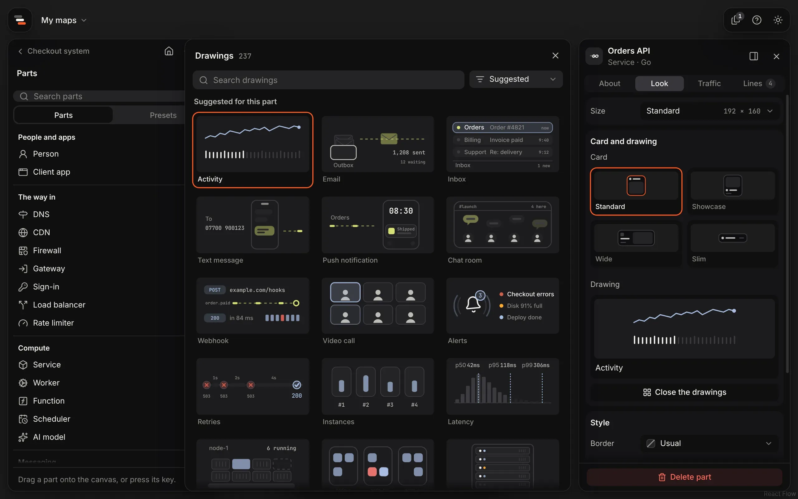
Section titled “Drawings”Each part’s panel shows a small live drawing of what it does. Every kind has its own, but any part can show any of the 237 drawings in the library: a service can show a card payment, a queue its dead letters, a worker a video being encoded.
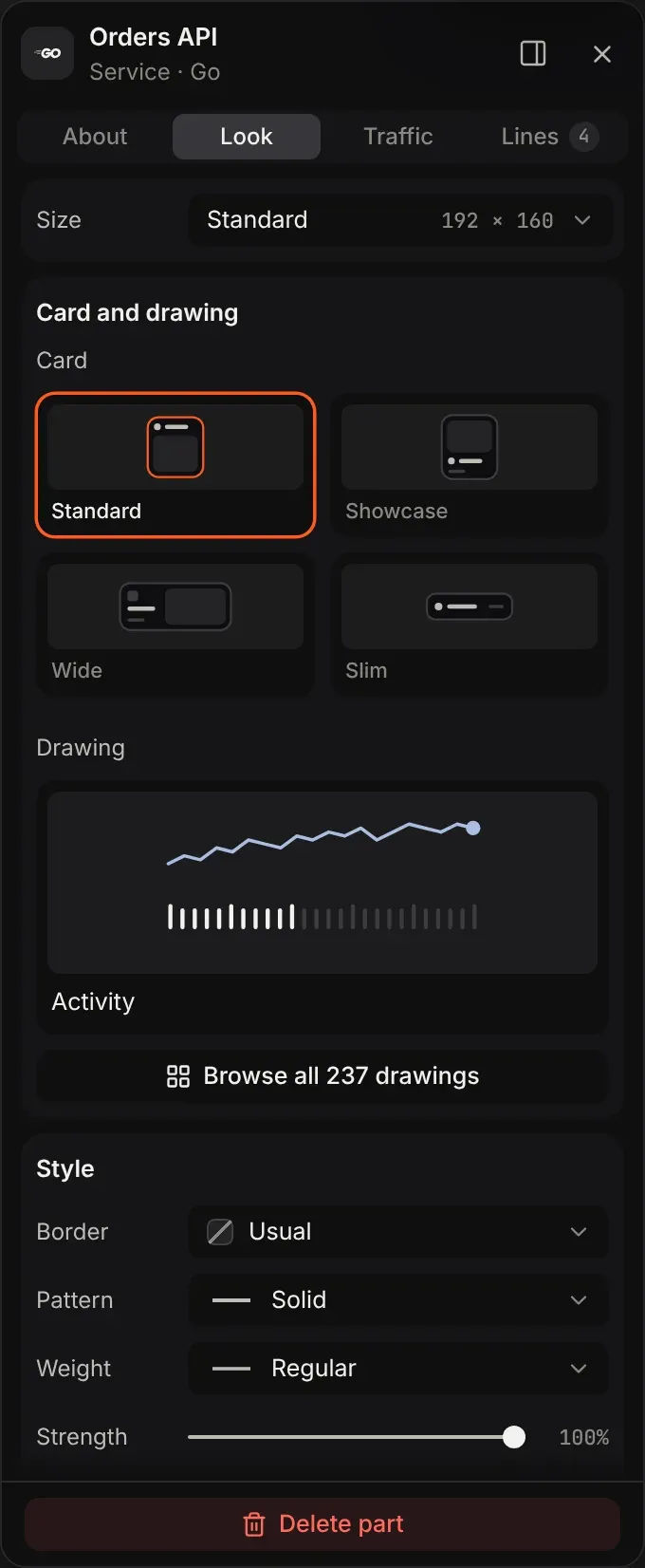
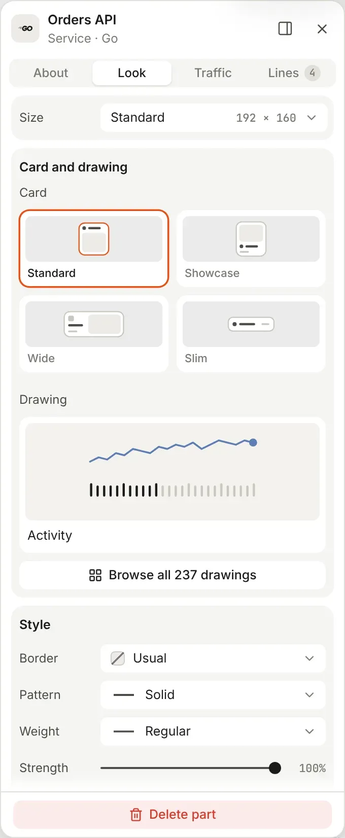
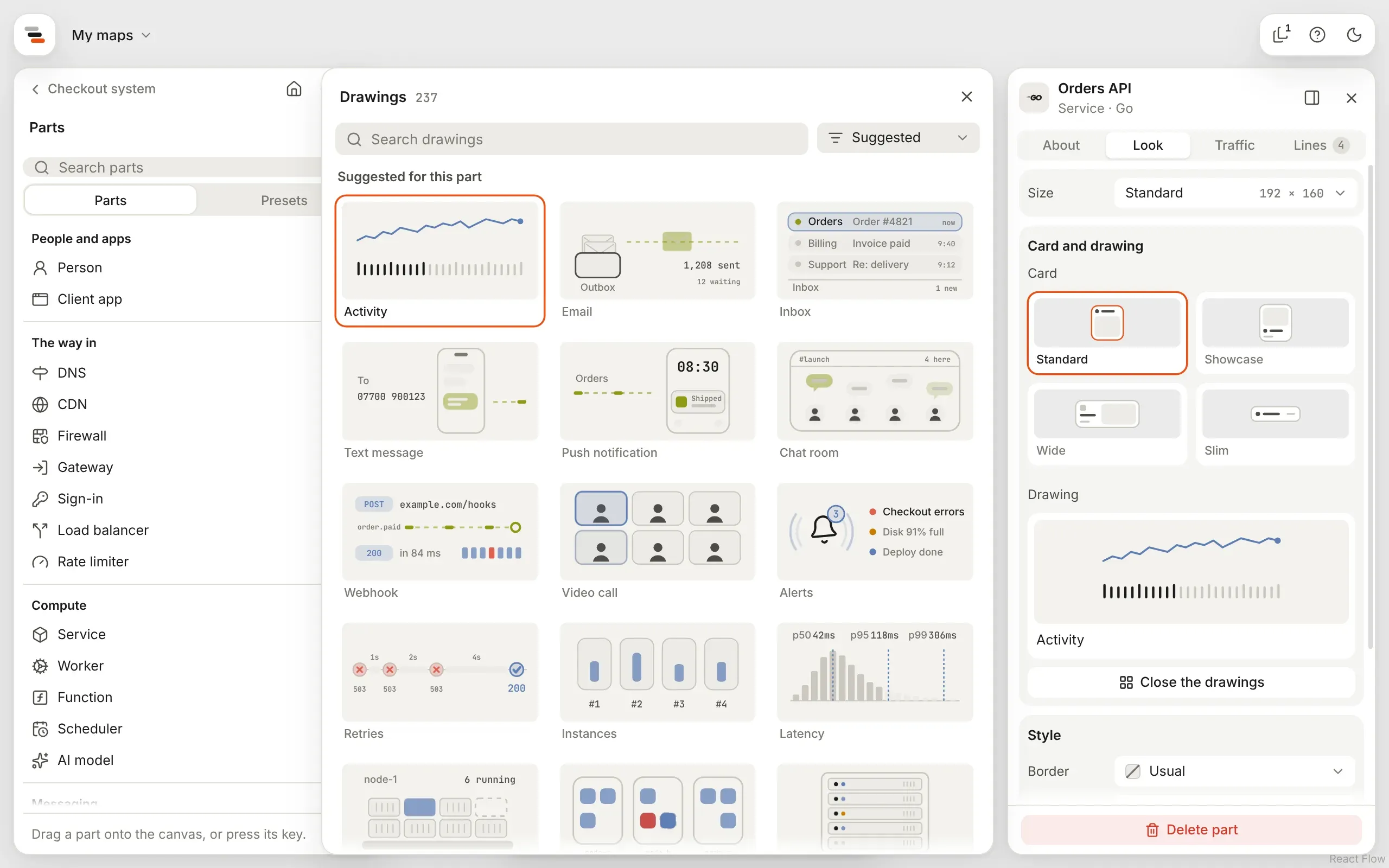
Under Drawing in the Look tab, the part’s drawing shows as one tile. Browse all opens the gallery beside the inspector. It opens on the drawings suggested for the part; search it, or pick a category from the filter beside the search. Picking a drawing applies it straight away, and the gallery stays open so you can try another.
Changing a part’s kind keeps a drawing you picked; a part showing its kind’s own drawing switches to the new kind’s. Drawings lists every drawing with what it shows.
Colours and styles
Section titled “Colours and styles”Give any part, line, zone or note colours of its own, so a map can mark out its areas: the EU region in blue, a team’s systems in violet, the risky path in red.
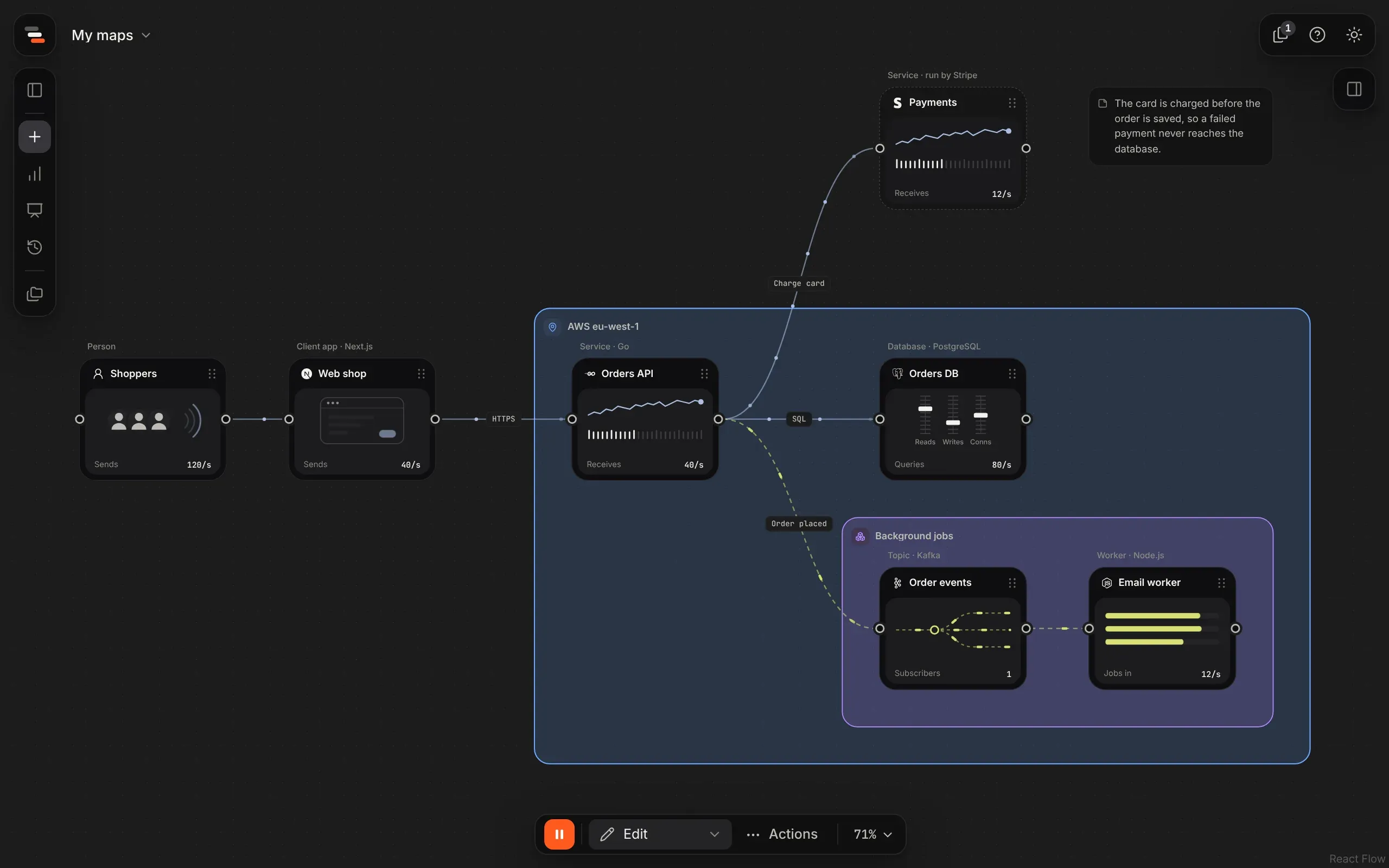
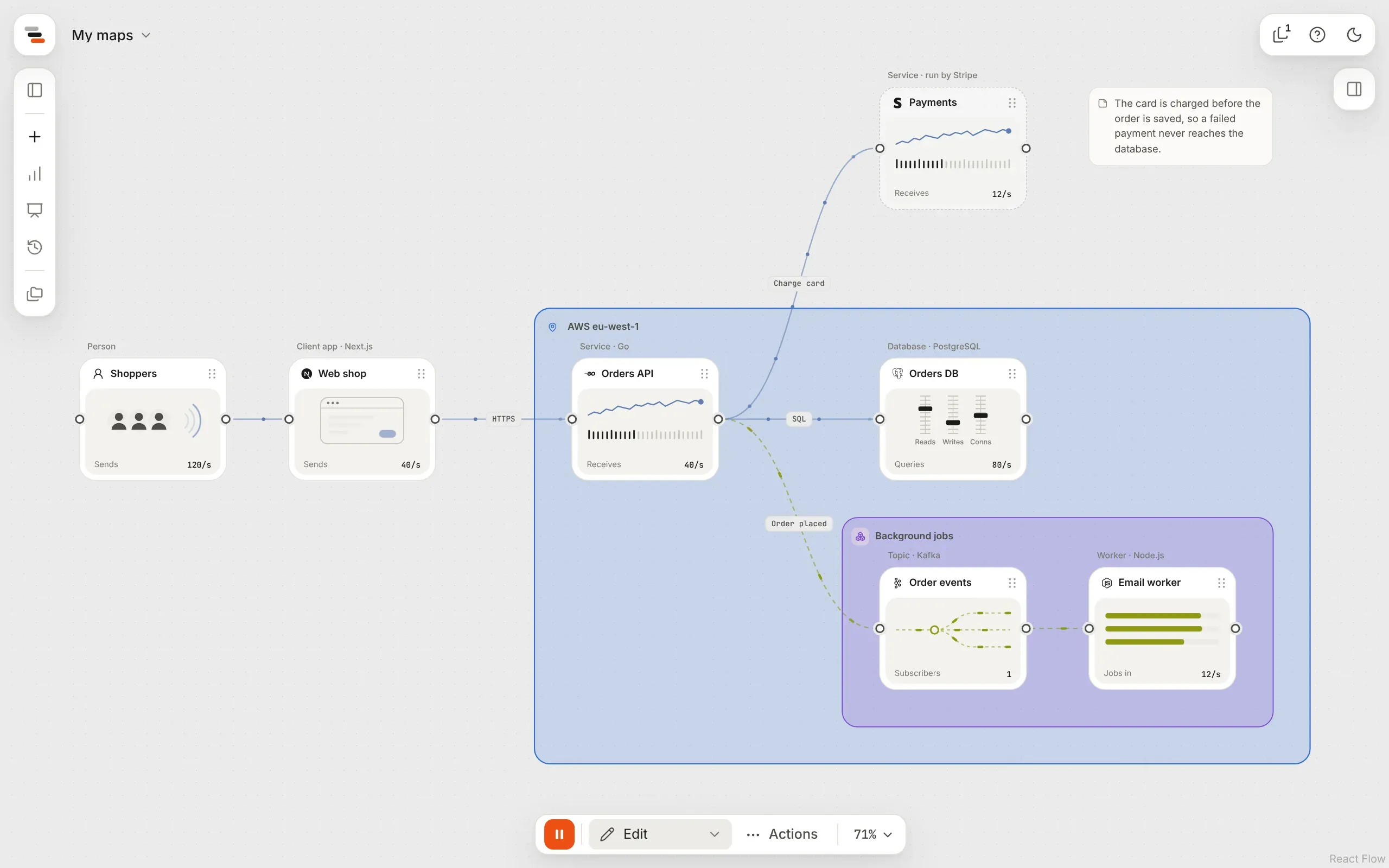
Select it and open its Look tab. The Style section has:
| Setting | What it sets |
|---|---|
| Border (or Line) | The colour of its edge, or of the line. Its button shows the colour; press it for the palette and a picker. |
| Pattern | Solid, dashed or dotted. A line can have no line at all, so only what moves along it shows. |
| Weight | Thin, regular or bold. |
| Strength | How strong the colour is. |
| Fill and its strength | The colour it’s filled with. Lines have no fill. |
| Effect and Route | Lines only: what moves along it and how it runs. See lines. |
A strength slider previews on the canvas as you drag it, and saves once when you let go. Reset goes back to the usual look. Select several things, and a change applies to all of them at once, as one step to undo.
How colours work
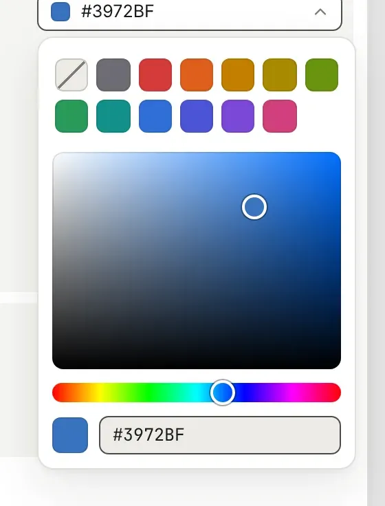
Section titled “How colours work”Colours are names from one palette (grey, red, orange, amber, yellow, lime, green, teal, blue, indigo, violet and pink), not exact values. Each theme draws them in its own shade, so a map reads well in both dark and light.
A colour of your own
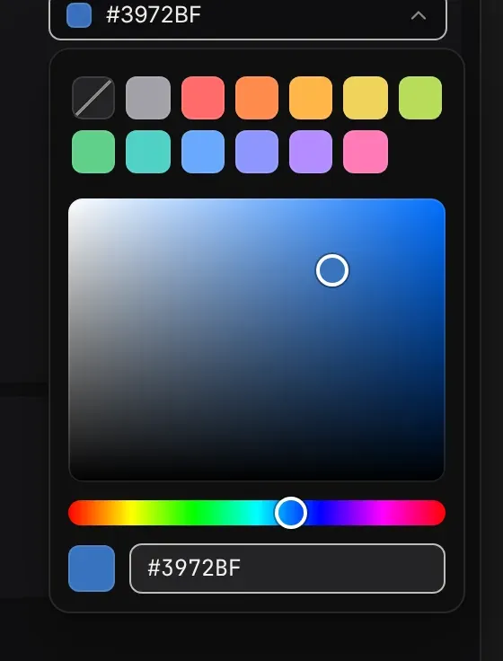
Section titled “A colour of your own”Press a colour’s button: the palette sits at the top, and a picker under it takes any colour.
Drag in the square for how strong and how bright, slide the rainbow for the hue, or type a hex
code such as #3a7bd5 and press Enter. The canvas shows the colour as you drag, and it saves once
when you let go. A colour of your own is drawn the same in both themes.
Good to know
Section titled “Good to know”- Give colour one meaning per map, such as the main path, or one team’s parts. A map where everything is coloured reads as if nothing is.
- A fill is always a tint, so words on it stay easy to read.
- Anything you leave alone keeps the item’s usual look, such as dashed for a message or dotted for a team.
- Selection and scenario outlines still show over a style.
- A coloured zone’s or line’s colour also shows in the map’s small drawing, at home and on the Maps page.